Case study · Education and research

Industry

Education · Research

Client

CEND, UC Berkeley

Year

2025

Scope

Website redesign

CEND, UC Berkeley. Making a research hub look as alive as its research.
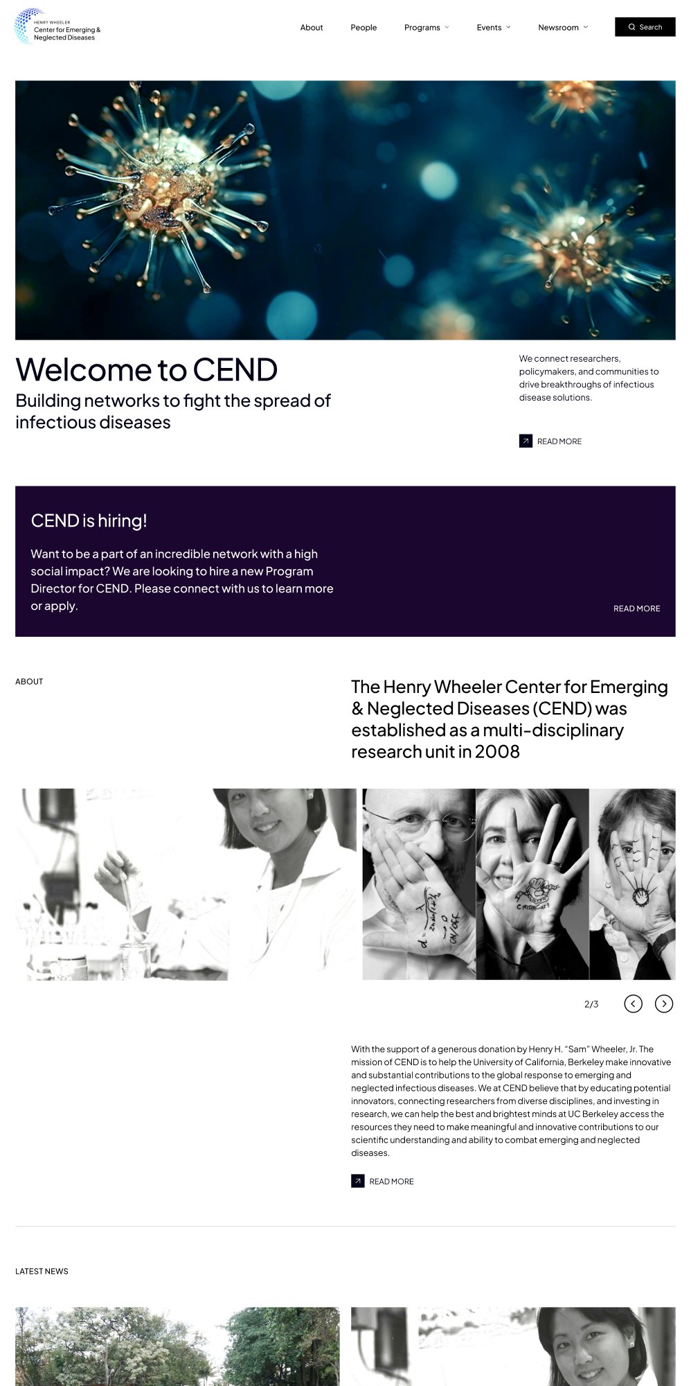

Redesigned CEND homepage on desktop: hero image, Welcome to CEND headline, hiring banner
Redesigned CEND homepage on mobile
Overview

From a 2015 archive to a site built around what visitors come to do.

CEND brings together 60+ Berkeley researchers working on diseases that hit poorer communities hardest. We rebuilt the website from the menu down: clear pages, one consistent style, and every page designed for desktop, tablet and phone.

Visit website

14

page layouts designed

4

screen sizes, desktop to phone

26

text sizes in one typeface

5

menu sections

Homepage at 1440 px
Homepage at 680 px
Homepage at 375 px
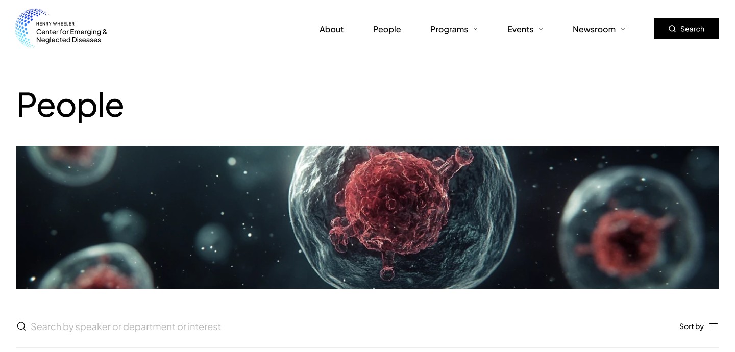
Desktop navigation on the People page: About, People, Programs, Events, Newsroom and Search
Mobile header with the navigation collapsed into a menu button
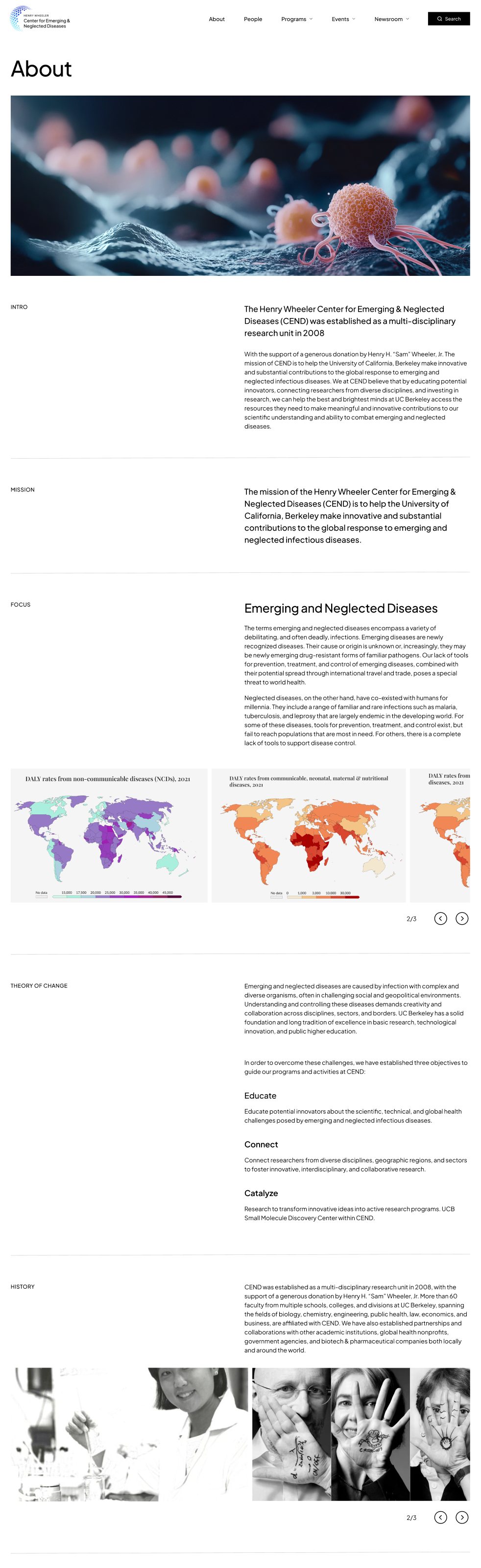
About page with labelled sections: Intro, Mission, Focus, Theory of Change
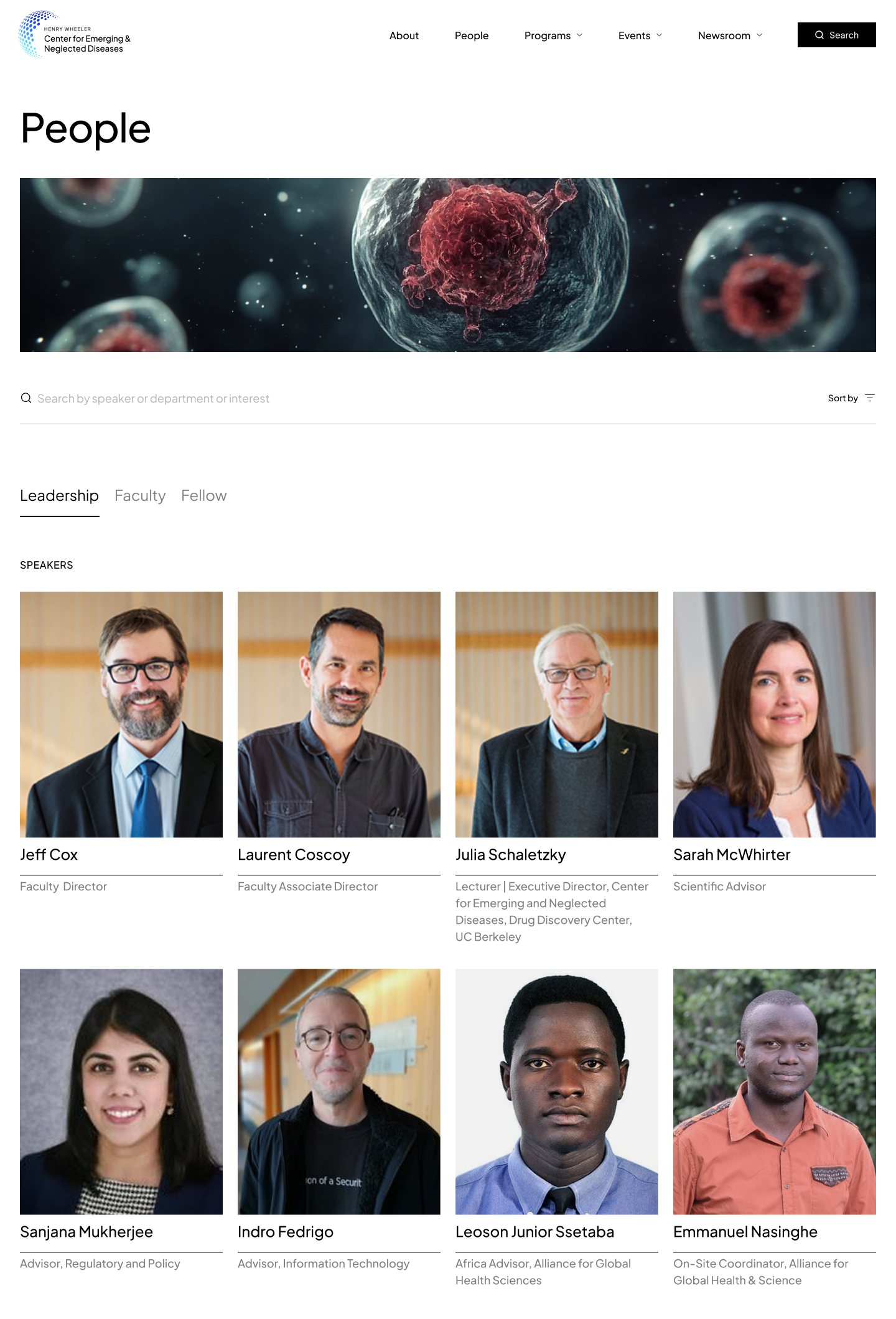
People directory with search, Leadership, Faculty and Fellow tabs, and portrait cards
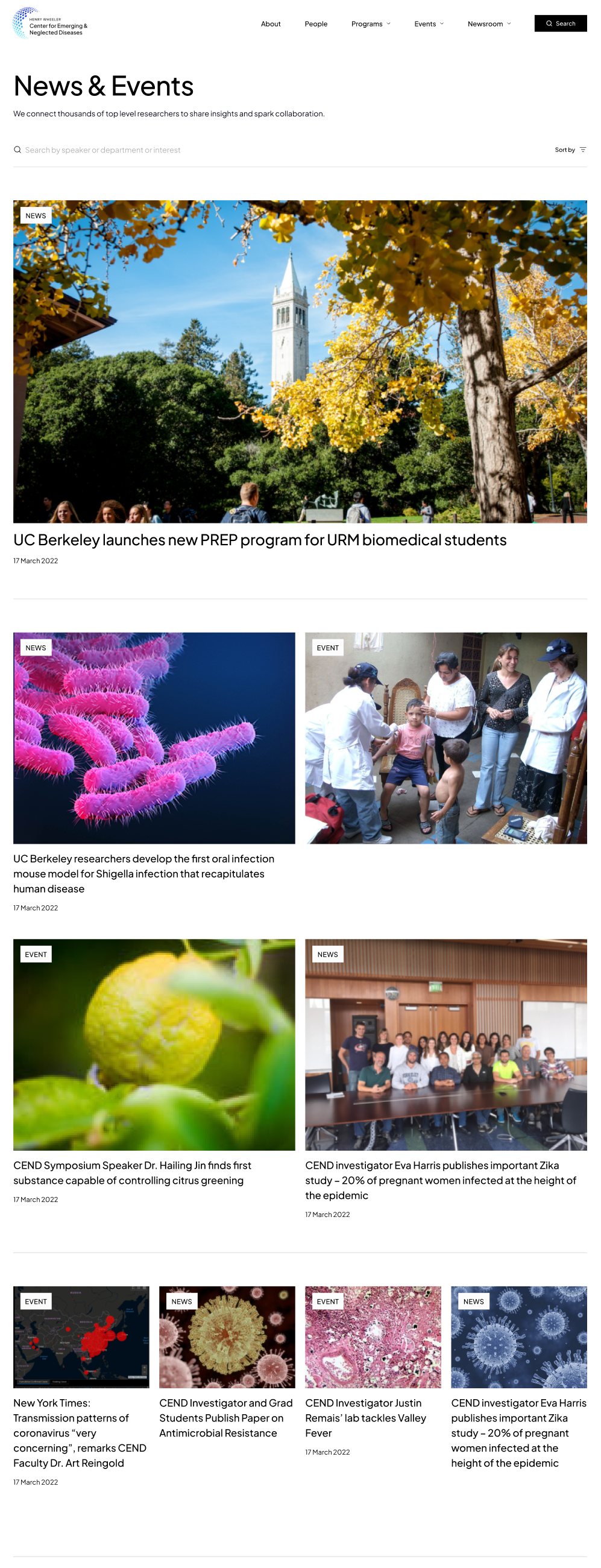
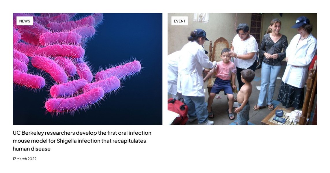
News & Events page from the top: search, then tagged news and event cards
Tablet homepage, top
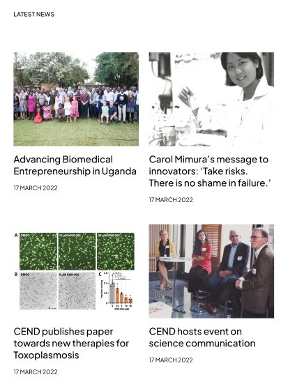
Tablet homepage, latest news
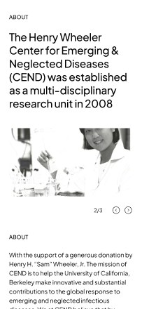
Mobile, about section
Mobile, latest news
Mobile, newsletter and footer
Full homepage scrolling on desktop
Full homepage scrolling on tablet
Full homepage scrolling on mobile
Design system

One system, every screen.

One typeface, black and white colours and steady spacing keep every page easy to scan. A profile, an event and a news story all use the same building blocks.

Homepage hero with the Welcome to CEND headline
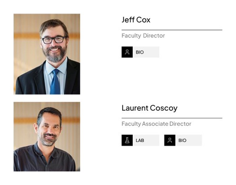
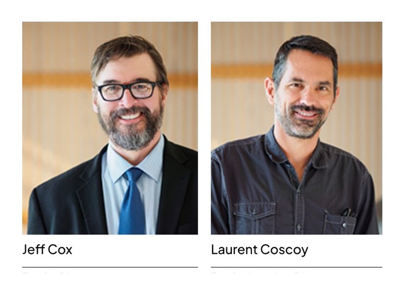
Leadership portrait cards
Tagged news and event cards
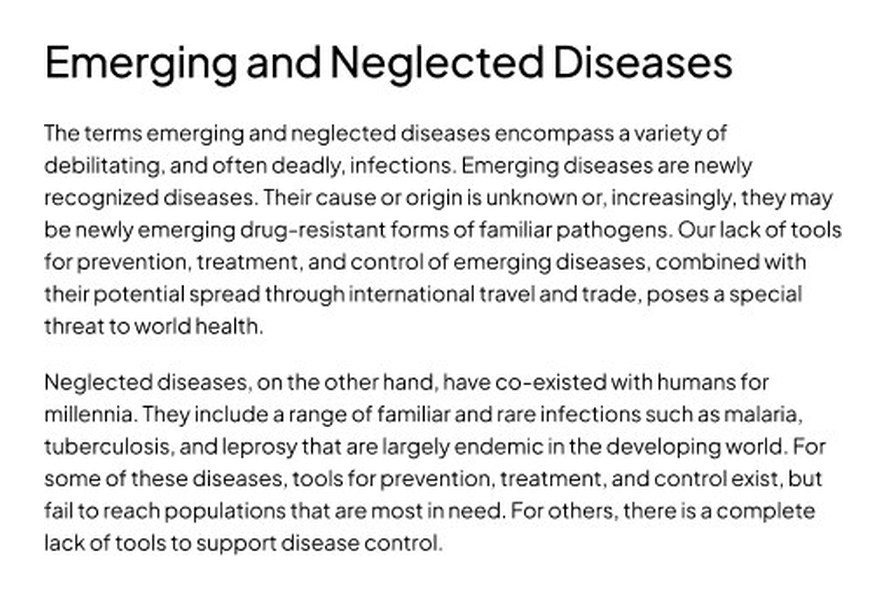
About page: Emerging and Neglected Diseases
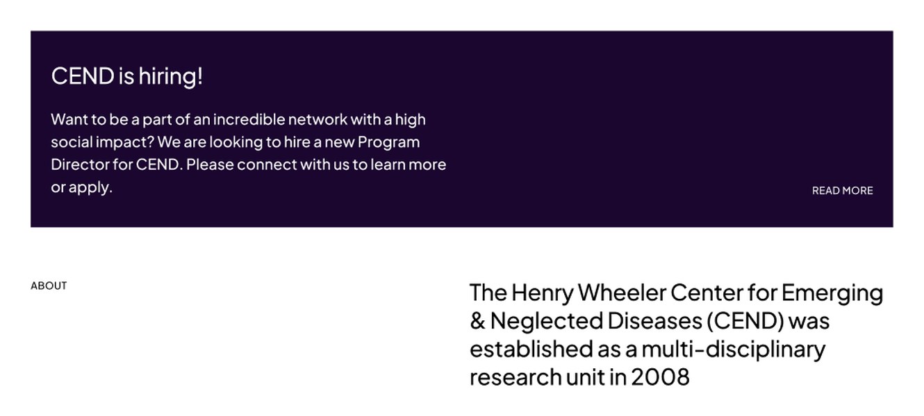
Hiring band and About introduction
Team preview cards
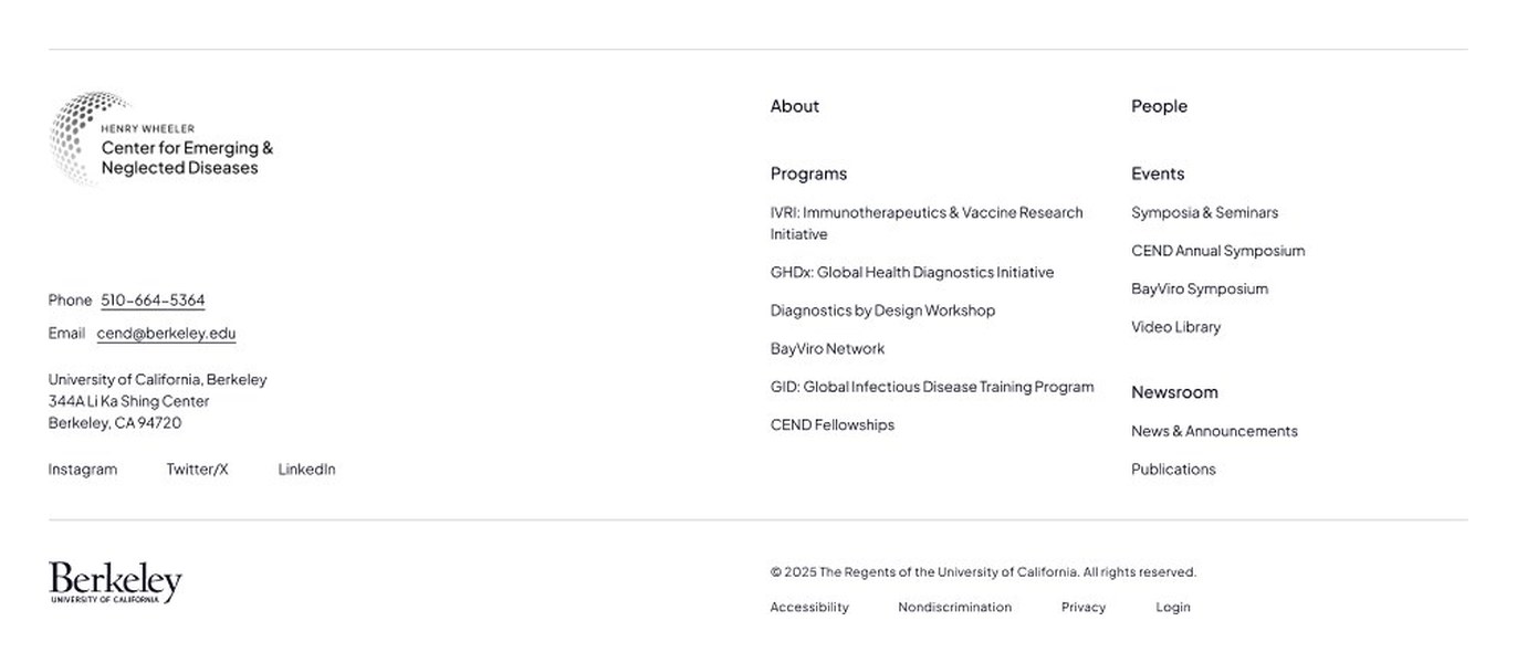
Site footer with programmes and events

Next case study

Arrow

EmailContact